Friday, August 10, 2012

Self portait

1. Why did you select the inspiration pieces?
When I first read about this project I had an idea that I wanted to create this self-portrait in charcoal and these three inspiration pieces are what I had in mind when I thought about creating my own. I wanted them to look like the two monochromatic portraits do. The one in color I I liked because of the shading.
2. Why did you select the media to create your self-portrait?
I selected charcoal to use because I like how it looks when it is a finished piece. I really like how it looks when it is used to create portraits. I really don’t like using it because I feel it makes a mess but I wanted to try it again.
3. What challenges did you face in creating your self-portrait and how did you overcome them?
When using charcoal I always feel like it gets everywhere and the paper ends up getting smudged. I really tried to be careful and wanted to not smudge it. I worked slowly and used very careful lines when I was working on my portrait. I had a hard time with the area around my mouth I tried to shade it and it worked a little. It’s hard to tell because of the way the picture took. It is lightly shaded, it was the part I kept re-doing.
4. How does this piece represent you?
It represents me because it really showed how I look and how I feel when I created my self-portrait. I really tried to do my best and show a realistic portrait of myself.
5. What elements and principles of art did you apply in this work?
I used monocratic color scheme I only used a charcoal pencil, so this was only black color and white paper. I used line in my face and the features. Also, I have shape in my portrait, because of my face and it the shape it takes up within the painting. Texture is shown in my hair and the area around my mouth. Balance is shown within my face if a line is drawn down the center of my face it is almost the same on both sides.
6. Did you enjoy working on this project?
I liked working on this project. I like working on hands on projects rather than writing papers. I like to be able to use the things that I have learned and apply them to a final piece.  I think that it is interesting to see how I have used art materials during the course of this class.
7. What do you think of your final artwork?
I thought my final portrait was good. I really tried to work hard and create a good portrait of myself.  I think it shows what I look like for the most part.

Picture of Myself
My Self-Portrait

Three Inspiration Self-Portraits from the Art Institute of Chicago
Rembrandt Harmenszoon van Rijn
Self Potrait drawing at a window 1648
Etching, drypoint and burin on ivory paper
130 x 156

Vincent Van Gogh
Self- Portrait
1887
325x410
Painting

Joseph Wright of Derby
Portrait un a fur cap
1765/68
Monochrome pastel on blue-gray laid paper
295 x 425

Thursday, August 9, 2012

Module 16


1. What were you expectations for this course and where they met?

I wanted to learn more about art and understand it more and gain more knowledge about art. I think these expectations were met. I have learned A LOT this semester. I didn’t think I would have learned this much in an online class.

2. Now that you've been through this course, What is art? How would you define it now compared to your intial posting?

My initial posting was the way that people express themselves. I think that it is not only the way people express themselves but also art can be anything. Things that you don’t think are art can very well be art. It is everywhere, architecture, sculptures, paintings and pottery these are just some examples of art.

3. Who was your favorite artist in your original posting and who is your favorite visual artist now? If there is a difference, why do you think so? If you have the same favorite artist, why do you think so?

I didn’t have a favorite artist when this class started, now I would say maybe Jackson Pollock is one of my favorites. I think his work is fun and very interesting.

4. Now that you've completed this course, how do you feel about taking an online course? Is your answer the same as it was in your first posting? How is it the same or different?

Yes my answer is still the same. I like taking an online class. I can get everything done at home and still learn and be in a learning community where I can interact with classmates.

Monday, August 6, 2012

Exhibit Review

1. Which projects did you review?
I review three project before I chose which I wanted to critque. I viewed the exhibits from Chelsea Wolfing, Jeff Bieber and the exhibit: For the Love of Music, I'm unsure who wrote it.

2. Why did you select the Exhibit you critiqued?
I selected this exhibit because I really enjoyed the Pop Art that she had picked. She got my attention with the bright colors and bold works that she picked.

3. What challenges did you face in writing the critique article and how did you overcome them?
I found it hard to think of things to write about. At time I felt like I was just writing a review of her exhibit and the works she picked. I really tried hard to focus on the questions and write as much as I could about her exhibit.

4. How do you feel about critiquing your peers work?
I liked writing about my peer because I was able to chose which person I wanted to review. I liked being able to review some and pick the one I wanted and most called to me. If I was given someone to review I don't think I would have liked it as much.

5. Would you like to read the critique your peers wrote about your Art Curation Project?
Yes.

6. On a scale of 1-10 how would you rate your finished article and why?
I would give myself a 9 or 8. I worked hard on the review and wanted to really give an honest look at her exhibit. I wanted to make sure I wanted to give her a good, well written review.

7. Did you enjoy working on this project?
Yes. I think that two pages was a little too long. It was hard to write that much about the exhibit I think I could have wrote a good review in one page.

Saturday, August 4, 2012

Video Blog Week 15


1. For each video list/discuss the key concepts you learned.

A. Greenberg on Pollock: Pollock was very skeptical of his work. He wanted to have a perfect painting. He wouldn’t be satisfied unless it was perfect. He would go back and redo and fix anything that he didn’t think was perfect.

B. The Critics from an Inside Story: An art critic thinks that when he writes an art criticism paper he thinks that they are helping the public. They look at something then can direct people to “good media works.” They are there to help the public and give them insight on if they should go a view it for themselves.

2. Do the videos relate to the creation of your Art Criticism project? If yes, explain how. If no, explain why not.

Yes I think that they were helpful because they got me to understand what an art critic wants to do and how they view their jobs. They want to help the public and review to see if they think that others should go and view it too. They want the public to understand the art that is out there and what they can experience and by writing an art criticism they can help the public and see if they may or may not like something.

3. What is your opinion of the films? Do they add depth to understanding of art criticism?

I liked these films. I think they were very easy to relate to and understand. The people were straightforward and clear. They gave their understanding and helped people to understand what their jobs were. In the Pollock video we even got to see that artists themselves were their own critics. They viewed their work and were their hardest judges. They wanted their work to be perfect and for everyone to experience it like they wanted it to be viewed.

Art Exhibition

The art exhibition project was very intersting. At first I found it difficult to narrow down a specific topic to chose from but as I looked at paintings I found that I was always drawn to the ones with water in it so that's what I ended up picking. I ended up doign a google search for paintings with water and that came up with Impressionist painters so I did chose a lot of paintings from Impressionist painters. I enjoyed doing this project, it made me look closely at what I would want in an exhibit and what paintings I would place within my theme. It was a lot of work and time to complete this project but it was well worth it, because I finally understand what it would take to put up a small exhibit, I have a very good appreciation for museum workers now.

Tuesday, July 31, 2012

Exhibition Videos


1. For each video list/discuss the key concepts you learned.

Lowdown on the Lowbrow- Lowbrow is art that is different than it ever was. After watching this video I think it is the art that appeals to different cultures. It includes art like pop art that gain the viewer’s attention and it is a certain type of art that makes people think and it may not seem like it makes sense it does in the end.

The Tate Approach- In the Tate Approach they used a thematic approach and organized it. They used four themes when they organized them. They used themes to match the works of art with the other works. They put theses matching themes together. I think it is better to have themes to organized because it organized art in the museum but also helps people to reconized the organization and works that relate to each other.

Bones of Contention- This movie is about the bones of 10,000 Native American’s are in museums to be studied and their relatives want their bones back. They don’t want their realtives back and they do not want them sitting in museums and studied. Native American’s are a large part of history so it is understandable that people want to study their bones but we also need to understand they were people and they might not want to be studied.

Philippe de Montebello- Montebello was the Metropolitan Museum of Art served for 31 years. He was able to get 84,000 pieces of art. He wanted to get “truly outstanding piece of work.” He wanted to make the Met a showcase for European art. He later made it all areas of the world showcase for art. He made this museum wonderful for everyone to look at and experience.

2. Do the videos relate to the creation of your Art Exhibition project? If yes, explain how. If no, explain why not.

They do relate to the creation of an Art Exhibition. They got me thinking about what needs to go into planning an exhibition if I was a real art director. Especially the Philippe de Montebello video, this video really got me to understand what goes into making a real exhibition. The Tate Approach made me think about themes and separating arts into themes to organize.

3. What is your opinion of the films? Do they add depth to understanding of the art concepts you practiced while creating your curation project.

I liked the videos they were very interesting. The Philippe de Montebello was the most helpful to the Exhibition project and so was the Tate Approach. The other two videos helped but they didn’t help me to understand what needs to go into creating an exhibition.

Saturday, July 28, 2012

Burchfield Penny Visit

Step 1: The Exhibition
Questions about the exhibit:
1. What is the title of the exhibit?
          The Artist Among Us II
2. What is the theme of the exhibition?
          The theme is artists that are from our community. The Burchfield Penny members decided to display the artists from our area before and this is the second time.


Step 2: The Gallery
Questions about the physical space:
1. What type of lighting is used?
          Most of the lighting that was used at the art gallery was natural lighting. They had skylights and large window doors in the front entrance way. They also had lights but they were only used to help the natural light. The day I went it was cloudy so the light aided the natural light.
2. What colors are used on the walls?
          The colors on the wall were mostly white paint. There was one room gallery on the first floor that was gray.
3. What materials are used in the interior architecture of the space?
The materials that were used were paint on the walls. They also had walls that curved around certain aspects of the gallery. It was used as a divider. There was also a glass wall on the second floor so you could look down and view all the art on the first floor. I didn’t realized it was there until I was on the second floor.
4. How is the movement of the viewer through the gallery space?
          The movement was very smooth and the walls were put together so that you could easily walk around the gallery and move about without getting confused or lost with the different artworks.

Step 3: The Artwork
 Questions about the artwork:
1. How are the artworks organized?
          The artworks were hung about the wall. They were atleast two feet from the round and went about 8 feet up. They were all arranged together so that you could easily view all the pieces. There was no order or arrangement they were just hung on the walls.
2. How are the artworks similar?
          The artworks are similar because mostly all of them could be hung on the walls. Also most of the artists are local or somewhat close to the area.
3. How are the artworks different?
          They are different because every artwork is unique and different. There were no two of the same or even very similar. All the pieces were a part of someone’s ideas and thoughts. Some of the art was photographs, drawings, paintings, and some were mixed media collages.
4. How are the artworks framed?
The artworks were all framed. Some were behind glass others were not. The frames were all different in colors and size.
5. How are the artworks identified and labeled?
          The artworks were identified on a off white plaque next to the work. It has the artist’s name, title piece and type of artwork.
6. What is the proximity of the artwork to each other?
          The artworks were very close together, only inches apart from each other. The frames are what separated the pieces.

Step 4: Art Criticism Exercise

Art Criticism: Describing, Analyzing, and Interpreting Artwork

Artist: Stephen C. Dubois
Title of work: O Schonheit
Media: Mixed Media and Acrylic
Date: 2011
Size: Unknown

1.   Be receptive - Keep an open mind.  Look for what is good.  No put-downs allowed.

2.   Description – Describe what you see.  (subject matter)?
This work is very interesting and fun. It has bright colors and seems to be have flowers in it with the mixed media. The art seems to be made of tissue paper that is twisted and collaged on it. The artist also put paint on the piece.

3.   Formal analysis – (form) What principles and elements were used and how are they used?
He used colors in this work. It is bright and dramatic changes between the bright yellow and darker blue. He also uses space with the mixed media. The media comes away from the piece and gives it a little dimension. There is texture in this piece. He used the mixed media and paint to create a texture on this piece. He used variety with the different variation of color and texture within the piece.

4.   Bracketing - Is there anything in or about this work that reminds you of anything else? Do you see any symbols, metaphors, or allegories?  (iconography)
This work reminds me of a garden. It is full of bright colors and some of the mixed media seems to be placed in a flower shape. It could be his interpretation of a flower garden.

5.   Interpretation - (content)  What do you think the artist was trying to say?
I think the artists want to show us the bright and variety that he could make. He wanted to show the different color variation within the artwork.

Art Criticism: Describing, Analyzing, and Interpreting Artwork

Artist: Christine Daly
Title of work: A Red Lily
Media: Oil on board
Date:2012
Size: Unknown

1.       Be receptive - Keep an open mind.  Look for what is good.  No put-downs allowed.
         
2.       Description – Describe what you see.  (subject matter)?
This artwork is a lily laying on a pail. The pail is sitting on a ledge or table against a wall.  The lily is red and the pail is white. The table is brown and the wall is an off white wall. This is very realistic and could have been painted from a real still life.

3.   Formal analysis – (form)  What principles and elements were used and how are they used?
The element of color was shown by the dull and muted colors within the art. Line is shown in the way the lily is laying across the pail. The line of the stem brings your attention to the flower of the lily. Emphasis is drawn to the lily flower. The flower is the only part of the painting that has color. She used scale because of the flower and pail is about the real size that it would be if it was lifelike.

4..      Bracketing - Is there anything in or about this work that reminds you of anything else? Do you see any symbols, metaphors, or allegories?  (iconography)
          There isn’t anything in this painting that I remind me of anything. It is very straightforward and it is what it shows; a pail and lily.

6.   Interpretation - (content) What do you think the artist was trying to say?
I think the artist was trying to show the use of color to emphasis something. She was able to emphasis the color element of the lily flower. She wanted to show the lily and highlight the variety and  color of the flower.


Art Criticism: Describing, Analyzing, and Interpreting Artwork

Artist: Kelly Root
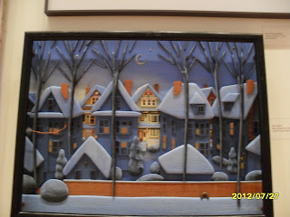
Title of work: Slue Snowfall
Media: Wood, found objects
Date: 2012
Size: Unknown

1. Be receptive - Keep an open mind.  Look for what is good.  No put-downs allowed.
    
2. Description – Describe what you see.  (subject matter)?
     I see a city street on a snowy night. A few houses are light up and the piece is in a view that seems to be behind the first set of house taken from their backyard.  The houses across the street are lite up which seems to be from the street lights. The snow seems to have just fallen and is the light powdery snow.  The trees in the front of the art is 3D like and come out from the background.

3. Formal analysis – (form)  What principles and elements were used and how are they used?
     She uses emphasis in the way that houses are lite up especially across the street because the front of the work is darker and the back is lighter and brighter than the rest. Line is also used in the trunk of the trees. Their trunk brings your eye down. The lines of the houses also brings your eye around the artwork. Texture is shown with the use of wood in the tree. The wood that is used is a different material then the rest and shows texture. Pattern is shown with the houses. All of the houses are about the same and are one after another. Unity is shown with the white snow and the shapes of the houses. They are all the same and look the same so they seem like they belong together. Balance is also shown in the way that she displayed the houses and they are equal apart and the same shape and size.

4. Bracketing - Is there anything in or about this work that reminds you of anything else? Do you see any symbols, metaphors, or allegories?  (iconography)
This art reminds me of a winter scene from a Christmas book. It is very story like and any writer could write a story based off of this picture. The pieces is very straightforward and shows what it seems to be depicting.

5.  Interpretation - (content)  What do you think the artist was trying to say?
          I think the artist is trying to express the way a city street looks like when the snow first falls. The artwork is shown with very detail and it is what a street could look like if you look out of your backyard on to the street behind you.


Step 5: Document Your Visit


Sunday, July 22, 2012

Videos from Week 12

1. Explain why you selected each of the FOUR videos you choose from the selection listed above.
Andy Warhol- I did not know a lot about Warhol and I wanted to learn a lot more than what I knew and what the textbook stated. I find it interesting to learn about these different artists and their lives.  I chose the video the Art of Henry Moore because it seemed interesting and I thought I would be able to learn a lot from the video.
2. For each video list/discuss the key concepts you learned.
Andy Warhol was very interested in a lot of celebrities like Marilynn Monroe and Elizabeth Taylor.  He created silkscreens of them and printed their images over and over again. It was a series that he created with Marilynn’s face using different colors. He created a 3.6 meter high image of Elizabeth Taylor was created of an image of her on a horse.
World War 2 had a large impact on Henry Moore he drew a lot of what he had seen during the war and what he remembered seeing from the war. He drew images of adults and children sleeping a train underground tunnel a safe place to be during the bombing. He created a memorial sculpture to remember the War and the people.
2. How do the videos relate to the readings in the text?
These videos gave different material then the book discussed. It added more to my understanding of the material and the lives of the artists and what they created in their careers.
3. What is your opinion of the films? How do they add depth to understanding of the readings and art concepts?
I really enjoyed these videos I really liked understanding about their lives and how their lives and the events that happened around them impacted their art work. Warhol used the death of Monroe to highlight her in his work and World War 2 had an impact on Moore’s work.  There wasn’t much about Henry Moore in the book, so it was interesting to learn about him.

Video from Week 11

1. Explain why you selected each of the TWO videos you choose from the selection listed above.
I chose the video Matisse and Picasso because I really didn’t know much about either painter and I wanted to learn more about them both.  I chose the film about Seurat’s painting A Sunday on Le Grande Jatte because I remember learning about Seurat in high school, my teacher had a saying “Seurat, Suerat painted with a dot.” This helped us remember the style of painting that he used while painting. It was the thing I remembered most from my high school art class.
2. For each video list/discuss the key concepts you learned.
Matisse always had a fear of painting. He was always scared of what to paint and where his inspiration would come from. He stated that he would wait for something that inspired him. Objects were his passion. He would only want to paint objects that others thought nothing of.
A Sunday on Le Grande Jatte- Seurat had a lot of things that influenced him during his career. The Egyptian culture the way that they portrayed their people is very similar to the way Seurat had. Seurat always painted them facing the side which is the way that they Egyptians had.  
2. How do the videos relate to the readings in the text?
The videos gave a lot more understanding than the book. It went into a more in-depth review of the artists and more details about their lives and their works. Also, what influenced their paintings.  
3. What is your opinion of the films? How do they add depth to understanding of the readings and art concepts?
The videos were fairly good. They gave more understanding and information about the artists which is why I had chosen them to view.  They gave more information about how they chose what to paint and what inspired them to paint certain material.

Tuesday, July 17, 2012

Mask Making Project


 Art Criticism: Describing and Analyzing Artwork Worksheet

Artist: Baule People

Title of work: Baule Mask

Media: Unknown

Date: 50+ years old.

Size: 11 inches by 5 inches

Source of picture (URL): http://www.genuineafrica.com/Baule_Mask_29.htm

1.            Be receptive - Keep an open mind.  Look for what is good.  No put-downs allowed.


2.            Description – Describe what you see.  (subject matter)?

There is a face on the bottom half of the mask. The top portion has a crown look to it. The forehead has a rectangular box in the center. There is a triangular shapes going around the face part of the mask. The color is a natural brown color.

3.            Formal analysis – (form)  What principles and elements were used and how are they used?

This is a monochromatic color tone to this African art. It is all brown with a little lighter brown around the eyes. The nose of the face creates a center line down the center of the mask that leads your eyes to the eyes of the mask and towards the outer part of the eye. There is a pattern of the triangles around the face of the mask. The mask is balance all around on both sides. If you were to fold this mask in half it would mirror itself. The proportions of the mask are proportion to the mask size and shape.

 Art Criticism: Describing and Analyzing Artwork Worksheet
Artist: Lega People
Title of work: Lega Mask
Media: Wood
Date: 45+ years old.
Size: 13 inches by 8.5 inches
Source of picture (URL): http://www.genuineafrica.com/African-Masks-Lega-Mask-4.htm
1.            Be receptive - Keep an open mind.  Look for what is good.  No put-downs allowed.
2.            Description – Describe what you see.  (subject matter)?
There is a face and on the face there is polka dots around the entire face. The eyes and mouth are both oval shapes (Almost football like.) The entire mask is a brown color. The nose comes out of the mask a little at the bottom of the nose.  
3.            Formal analysis – (form) What principles and elements were used and how are they used?
This is a brown monochromatic color tone to this African art. It is all brown and has a little bit of lighter brown.  The make has a unity in it because of the color and the spots around the entire face. The line of the nose makes your eye move around the mask. The proportion of the mask is entirely even around the mask this also gives it a balance. The spot gives emphasis and variety to the mask. It gives something visually to look at that is pleasing to the eye.
Art Criticism: Describing and Analyzing Artwork Worksheet
Artist: Dan People
Title of work: Dan Mask
Media: Wood with cowry shells and bells
Date: 60+ years old.
Size: 12 inches by 8.25 inches
1.            Be receptive - Keep an open mind.  Look for what is good.  No put-downs allowed.
2.            Description – Describe what you see.  (subject matter)?
The Dan mask has an oval face to it. It has a crown going around the top of it. The crown seems to have shells around it. The eyes on this mask are closed. It has bigger lips and large eyebrows. It also has a large protruding forehead. The color of the mask is monochromatic except for the off white shells around the entire head.
3.            Formal analysis – (form) What principles and elements were used and how are they used?
This mask is mostly monochromatic with the color being all brown except around the eye and the shells. It has an emphasis of the shells that gives it a variety and a little bit of off white color. The shells also create a line that makes your eye move around the top of the mask. The mask is all even and proportion throughout the whole mask. The shells also give some texture to the mask. The mask is completely balanced throughout and is even on both sides

My Mask


Sketches


I used many elements and principles in my finished mask. I used the element of color. I used bright color and colors that contrasted each other. Unity is shown in the use of the triangles around the outer edge of the mask. This also created balance with the triangles and the symmetric eyes of the mask. The line of the line of the edge of the triangles also creates a line that allows your eye to move around the mask. Variety is created with the use of colors. The colors are all bright and different. Unity is also created with the use of circles for both the mouth and eyes.
I liked making this mask. At first I was nervous about how my mask would turn out and how I was going to create it. After I started looking at masks online it made me feel more comfortable and I was able to complete this project with ease. I liked thinking of ideas that I wanted to incorporate and use with my mask. I think it looks a little more creative than a mask I found online just because of the color element that I had. I wanted to have the color to add more variety to it plus mine was made out of clay and the ones online were made of wood which is normally only one color.

Week 10 Video Review


 1. Explain why you selected each of the TWO videos you choose from the selection listed above.

African Art- I have always thought African art was interesting to look at. I wanted to know more about it and understand where they got their inspiration from.

Buddhism- I like the beliefs of this religion and I was again interested in learning more about the religion of Buddhism.

2. For each video list/discuss the key concepts you learned.

African Art- The only time a living thing or animal is portrayed in a piece of African art is when a king or ruler is being portrayed that is the only time it can be created.  It was because of this that art was used to please ancestors and spirits. Most often they are in statues and masks were used in art. The dead is believed to give powers to the living.

Buddhism- The Great Stupa has a walkway around it. Everything around it is in contrast to the Stupa. A pilgrim must always walk clockwise in a temple as per tradition; the pilgrim will forget everything and be able to open their mind.

3. How do the videos relate to the readings in the text?

The videos add more to the reading. I feel that the reading is like a quick introduction and the videos go into more detail and understanding of the subjects.

4. What is your opinion of the films? How do they add depth to understanding of the readings and art concepts?

I liked the films. They were interesting and gave more of an understand than the book does. They explain more of the background information that helps to understand more of the concepts that are needed to understand Buddhism and African art.

Week 9 Video Review


 1. Explain why you selected each of the TWO videos you choose from the selection listed above.

Leonard Di Vinci: The Mind of the Renaissance- I chose this video because he is a wonderful painter and I wanted to learn more about him and his work.

The Drawings of Michaelanglo- I wanted to learn more about Michaelanglo and the ceiling of the Sistine Chapel that he painted.

2. For each video list/discuss the key concepts you learned.

Leonardo Di Vinci- When Di Vinci works he spends all his time thinking about his work. Sometimes he forgets to eat and drink. He will think about his work and not even start to paint until he has it completely planned out, where he wants people, balance and symmetry. He wants his work to be perfect and it was.

Michaelanglo- Michaelanglo drew all of the human figures before he painted them on the ceiling. Michaelanglo had a plan for all of the figures especially the depiction of God and Adam. He planned to draw Adam’s body in a curved way to make it fit into the artistic depiction that he wanted to portray.

2. How do the videos relate to the readings in the text?

The videos related to the material in the readings. It add more on top of the material that was covered in the book, it gave more information and gave a little more understanding of the artists and their work.

3. What is your opinion of the films? How do they add depth to understanding of the readings and art concepts?

I thought the films were interesting. They gave a deeper understanding of the material and what was read in the chapter. As I read the text sometimes I want to know a little more about the artists or concepts and these video help with that wanting more.

Exploring Lines

1. What was it like using your hand as subject matter for a drawing?
It was a lot harder to use my hand than I first thought. I kept moving my hand because I like to hold my paper when I draw and I couldn't because I had to look at my hand.

2. What media did you select - pencil or charcoal? Why?
I used pencil because I had a hard time using charcoal last time I was drawing. I felt like the charcoal ended up everywhere and I kept trying to keep it clean and wipe it away with my hand. I know I needed to keep my hand still so I could draw it so I wanted to use something that I was completely comfortable with and that was a pencil.

3. How did it feel to create a drawing with your non-dominant hand?
It was really hard. I feel like it was a terrible job and I wanted to make it look better but everytime I tried it didn't look any better.

4. Compare and contrast your final drawings. Do you think they are successful studies?
My final drwaings are good. Drawing hands are hard. There are a lot of lines and wrinkles. You see your hands everyday but once you are really looking at them and studing them you notice there is a lot more to your hand than you think.

5. Would you consider using your non-dominant hand to create artwork in the future?
No. I would not use my left hand at all unless I had to for a future project. It was harder to draw and uncomfortable.


Drawing with Non-Dominant Hand


Drawing with Dominate Hand


Tuesday, July 10, 2012

Chapter 14/15 videos


1. Explain why you selected each of the three videos you choose from the selection listed above.

More Human than Human- It was selected for me to view

The Black Death Visits Tuscany- I like to learn about the Black Death. It is a very interesting disease and it has a huge impact on any area that it reaches. I just wanted to learn how it affected Tuscany.

The Birth of the Middle Ages- This is an important time in history and I like to learn about the Middle Ages. The castles and emperors of this time interest me.

2. For each video list/discuss the key concepts you learned.

More Human than Human-  The brains of the artists making female statues (Venus) embellished female feature because that is the way their brains may have been programmed. They needed to place emphasis on the curves of the female bodies because that is what was best for fertility.

The Black Death Visits Tuscany- With people dying and the city struggling people didn’t have money for artworks, until the mid-1350’s. The depictions are flatter and give less emotion away to the viewer. People were less optimistic of life and the effects of the Back Plague were still on artist’s minds. The depictions of hell are a very important topic of the arts in this time period. The ways of death and reason of death are a popular topic after the Black Death.

The Birth of the Middle Ages- The fortified middle ages town was a city surrounded by a wall to protect them. The people of this time started to use natural boundaries like mountains. Survival was the most important thing in the people’s lives. The people started to go to the country because it was safer and less violent than the walled cities during this time.

2. How do the videos relate to the readings in the text?

These videos add more to the reading I am very interested in this time period and I like to read about these times. The people of this era interest me and I like to hear how they lived their lives and their thoughts about the life they were living. The videos added more to the reading. The reading gave an overview of the material that is beign taught but the videos highlight and go into more detail.

3. What is your opinion of the films? How do they add depth to understanding of the readings and art concepts?
I think the videos were very good in my opinion. They were very interesting to me because I like this time period

Sunday, July 1, 2012

Architecture


 1. For each video list/discuss the key concepts you learned.

Praire Style: Frank Lloyd Wright is very popular architect around our area. His ideas of Prairie style home create a unique space in homes. The homes are wide open and create a one with the nature around it. The homes are long and the rooms seem to blend together as you walk through. The houses have lines (horizontal lines) that run across them. The house is “unique” experience because you don’t see a normal house setup when you walk into one of his houses. The house is open and rooms are almost one. The outside entrances are almost hidden because he doesn’t want to emphasis the door but the house and the environment. These homes are wonderful and I have been to the Darwin Martin house it is interesting to see how this video highlights the feature in that home as well.

Architecture: Science and Design: During this video the most interesting and  key concept I learned was the smart apartment. I thought it was interesting how they can create this house that is all controlled from one spot. The computer/ or telephone can create everything that is needed for a home function. The hot water can be turned on before you wake up and the heat can be increased. I find all of this amazing. I would think that this is something from a movie not in a real home. Everything that you do or don’t do the computer keeps track of and regulates itself accordingly.

Classical Architecture: During England history some of the classical buildings started to become replaced by new architects and designs. Churches, parliament and the Bank of England building are all examples of buildings that had some classical designs and were then redesigned with a newer updated modern architecture. These buildings were part of history and their original classical look showed it’s age and after it was updated it gave it a new fresher look to it.

Frank Gehry: Architecture as Art: The Guggenheim museum is a very interesting building; it was create by Gehry and seems to have curves and shapes surrounding the museum. The building is an icon that is understood and very popular. The museum is a powerful symbol of where architecture is going and what today’s architects are striving to reach.

2. How do the videos relate to the readings in the text?

The videos add to the reading in the textbook. It just helps to further the understanding the architecture has a powerful impact on our lives. Architecture is everywhere and it is something that I never really thought much of but after reading the material and viewing the videos I see that it is very power thought out history and still is today.

3. What is your opinion of the films? How do they add depth to understanding of Architecture?

I found the videos to be very interesting. They go into great detail and help understand the textbook further. Architecture is very important part of our lives and it needs to be understood and the history is important part of its understanding. These videos and the textbook help further the understanding.

4. From the group of four that you had a choice: Why did you choose that film?

I chose the video about Frank Gehry because I was very interested in his work. I haven’t seen anything in person but I have heard of him before and I wanted to know more. I love how he uses such new ideas and strives to create these building like the Guggenheim museum to create a wonder and curiosity in everyone who views them.

My installation art.

1. Include answers from Step 3.
A. What is installation art?
Installation art is work of art in a specific location to transform the area.  The artwork takes up the area that it is in and is able to stay at the location.
B. What materials are used installation art?
Anything can be used in installation art. Paint, Wood, Paper, Flowers Billboards, Steel, and chairs; anything that the artist wants can be included in the art can be used in an installation artwork. The artist is the one that choses what he wants to include and what he wanted to be part of his artwork.
C. Why make installation art? 
An installation art I feel gets people thinking about the artwork. It makes people think about different objects in their lives. When you see something unusual in a space that normally shouldn’t be there it makes you think. Artists want a way to express themselves too. Installation art gives the artists a way to express themselves and they can use installation art to express themselves.
D. Which artist/installation did I find most interesting?
I liked the artist Andy Goldworthy. He created an instillation art that takes a while to make but doesn’t last long. It will normally break and fall apart. The piece that I found most interesting is Reconstructed Icicles, Dumfrieshire (1995).
2. Include answers from Step 4.
A. From the material reviewed, is there an inspiration piece that I feel a connection with?
 The piece that I am most connected with was Andy Goldworthy’s Reconstructed Icicles, Dumfrieshire (1995) To create this piece he reconstructed icicles and refroze them. He created this unique design around the tree. I would have never thought to do something like this. He created a work of art using just ice and he used something that, here in western NY we see all the time, icicles. They are everywhere and I see them for months but I would have never thought to create something like that. Also, he creates something that only lasts for a few hours. He probably spent a lot of time creating this icicle and it only lasts a few hours and it will probably fall and break apart. It is just a great piece.
B. What theme do I want to explore in my installation? Refer to your textbook if you need to review Themes of Art. (chapter 3 in text) (Nature, Environment, Self, Mass Media, Consumerism, etc.)
The theme that I chose to work with was nature. I enjoy being outside and I wanted to make something outside. I also decided to use something that is found in nature which was wood. The wood pieces allowed me to create the artwork and it’s design.
 C. What materials will I use?
Wood Pieces and Arcylic Paint on some of the Wood Pieces.
 D. Where will this installation be located and why?
This will be installed in the backyard. I wanted to have it in an outdoor space so that I could view it. I wanted to put it in my girlfriend’s flower garden but with all the flowers we couldn’t find enough space to put it in. I chose a corner of the grass so the piece could be displayed.
3. Include digital images from Step 6
Front View
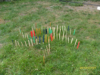
 ( You can see the center circle with the colors and the swirls that end in color)

Side View

Angled view

Another side view

Far-side view

Look from above

4.& 5. Describe your installation. Be sure to use the worksheet from Project #3 as your guide. Analyze your installation. Be sure to use the worksheet from Project #3 as your guide.

Art Criticism: Describing and Analyzing Artwork Worksheet
Artist:  Richard Cruz
Title of work: Wood in the Grass
Media: Wood pieces and wood with acrylic.
Date June 30, 2012
Size:  3ft by 2.5 feet
1.            Be receptive - Keep an open mind.  Look for what is good.  No put-downs allowed.
2.            Description – Describe what you see.  (subject matter)?
As I look at this piece of artwork I see wood pieces and they are in a specific pattern all facing one direction. The center circle has four colors going around and then there are swirl lines coming out from the circle. At the end of the swirl the color is again visible and it is the same color of where the swirl began. It is a very interesting to look at and with the piece being outside the shadow of the wood pieces also plays a role in the artist value of the artwork.
3.            Formal analysis – (form) What principles and elements were used and how are they used?
There were a lot of elements and principles being used in this artwork. First color the grass and the four vibrant colors used on the wood, and the color of the plain wood. Line is also used with the wood pieces in the grass. The wood pieces are straight up from the ground up and also the swirl of the line coming from the center of the circle. The circle is also another line while it is going around the center.

6. What are your thoughts on the planning and creation of a site specific installation?
At first I was a little confused on what to do and I was unsure of how I wanted to create an installation piece. I looked around at different materials and as soon as I found these wood craft sticks I knew what I wanted to do. I wanted the original wood look on some of the wood and the other I wanted to have color. I wanted the color to pop out so that is why I only used a few colors and used them sparingly. Once I came up with the idea I was excited to start and I liked creating this piece outside.